Understanding an interactive story map
It’s not every day something new happens with mapping.
A recent Fast Company article described an interactive story map called “Celebrating Lost Loved Ones.” The map provides a way for those who have lost loved ones to opioid addiction to enter a picture and note about their loved one. The combination of objective geocoded data (where they lived) and a photo of the deceased with a note from the ones that loved them most is something wonderfully new: a more human map.
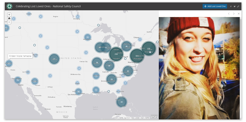
“Amber Leigh Roberts- Feb. 20th, 1996- June 28th, 2015 98033, Kirkland, Washington
Best laugh in the world, loyal, caring, beautiful on the inside and out. Loved to dance. Would drop anything to take care of her friends. Best daughter in the world.”
Although this kind of interactive story map is something new-ish, the underlying concept of putting an x where something happened is one of the oldest concepts in the world. The oldest known map, the Babylonian Map of the World, has little circles denoting the location of villages. A dot indicating a city chiseled into a rock 2,000 years ago is the same concept as a dot indicating an overdose on a map in 2018. The Loved Ones interactive map is a Crowd Sourced Story Map in ESRI speak, but at it’s core, it’s a geocoded map.
Let’s look at what works here.
The tri-color scheme is rockin’. It’s monochromatic blue hues are intrinsically easy on the eyes. Research has proven blue as the easiest color for human eyes to discern the difference among hues and most people find it appealing and professional looking. It photocopies well, even on a black and white photocopier since it’s easy to see a dark to light color scheme. Also, most people intuit that darker colors mean higher values, and lighter colors mean lesser values, which aids in map comprehension.
The proportional symbols make the map much easier to read, rather than having a lot of tiny little dots. Although there I have a concern with the methodology. Overdoses are typically reported as 1 per 100,000 people, like this thematic map.
The basic issue is that all the larger cities will naturally have enormous dots over them since there are simply more people there, ergo, more opioid deaths. But the point of the Love Ones interactive story map is not to quantify the problem, but to humanize it. And on that point, it does a fantastic job. But still, those dots are always going to be enormous. Just sayin.
What really makes this work though, are the faces, particularly the eye contact with the audience. The personal notes are the coup de gras. So this kind of story map will be particularly helpful, for any geocoding project where individual people are the incidents. This may not work as well if you were geocoding, say, parking lots.
Obstacles of the examined story map
As fabulous as this interactive story map is, there are two things which make it impractical for the everyday mapper. For one, it’s crowd sourced. This story map went viral and has been able to garner lots of uploads. It only works for this reason. The chances that your story map also will go viral are slim. The second obstacle is that for this kind of story map, you need an ESRI paid subscription which allows publishing. This is $49 per month if you were to buy it individually. So, to make it work, you’d have to spend about $600 a year, or your company or funder would. That’s a significant investment. On the other hand, if your company already has an enterprise licensing agreement with ESRI (like a municipality might) then it’s just a matter of getting the proper login credentials to be able to access the Story Map templates on ESRI’s site.

Creating a story map as in the one in the example
But, there are still some things you can do that similar to this that might be helpful with your story maps.
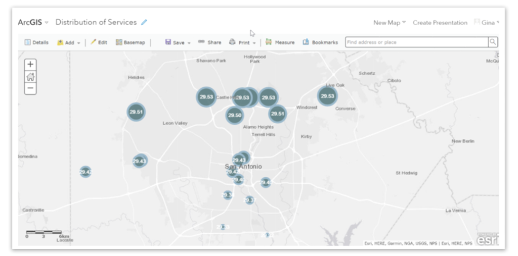
After geocoding in ArcMap you can import the shapefile to ArcGIS.com and symbolize it with proportional symbols if your data lends itself to that, or just as dots if that’s better. (To learn how to geocode see Chapter 8: Address Mapping in The GIS 20: Essential Skills book.)
Once it’s open in ArcGIS.com, you can do the following to make it look similar to the Loved Ones map.
1. Change the style of the symbol to Basic and select the first circle
2. Change the fill to RGB #4B7275 (you can’t change the other values)
3. Make the circle 50% transparent
4. Change the Outline to #84AAC2 and the line width to 5
5. Put labels on and change it to bold, white and aligned in the center
6. Change the default topo map to Light Gray Canvas
You can now share your story map or embed to a website using the Share options in ArcGIS.com.
Also, if you do have a local level project that lends itself to having human faces when you click on the map, you can put those hyperlinks in ArcMap in your geocodes attribute table and when you import to ArcGIS.com, they will be active links to click on. Note, the images must be hosted elsewhere, on a site like Flickr.
If you’re interested in Story Maps and how to make them and have a license that lets you do so, ESRI has many good tutorials here.
Recent Comments